The New Travelhorse Logo: How We Redesign a Logo for Logistics
4 Jan 2021 / Monday / 3:00pm
The New Travelhorse Logo: How We Redesign a Logo for Logistics
This week we sat down with the project’s Design Lead, Diyanah, to find out how she went about re-imagining the Travelhorse icon for a new era.
New Year, New Look.
The year 2020 has brought unforeseen challenges and changes for everyone and Travelhorse is no different. Changing lanes from a luggage logistics platform connecting users to local shops and businesses for temporary storage to a logistics platform connecting businesses with its customers was just a way for Travelhorse to adapt to the new normal. Travelhorse has now grown, acquired clients and found a good grove of being a smart urban logistics platform.
Changing Logo Design
With Travelhorse having to change its business course, we believe it was only right that our logo did too. For Diyanah, the goal was to try and create something new that could bring out the essence of a logistics company. “I just started sketching new icons and logos that came to my mind, no matter how outlandish,” she explains. “The goal was to throw ideas and see what we could move forward with.” Next, she started to explore the different approaches in colours. We did not want to change the entire logo which our clients had grown familiar, however, we knew that the luggage icon had to go to make way for a more relevant symbol. It was quickly decided that the new central image within the logo should represent a parcel. While deciding this was easy, it was not a simple choice. From there, getting tasked to choose the right visual that suited the company required brainstorming and research. There were more possibilities of parcel designs than we could ever imagine.
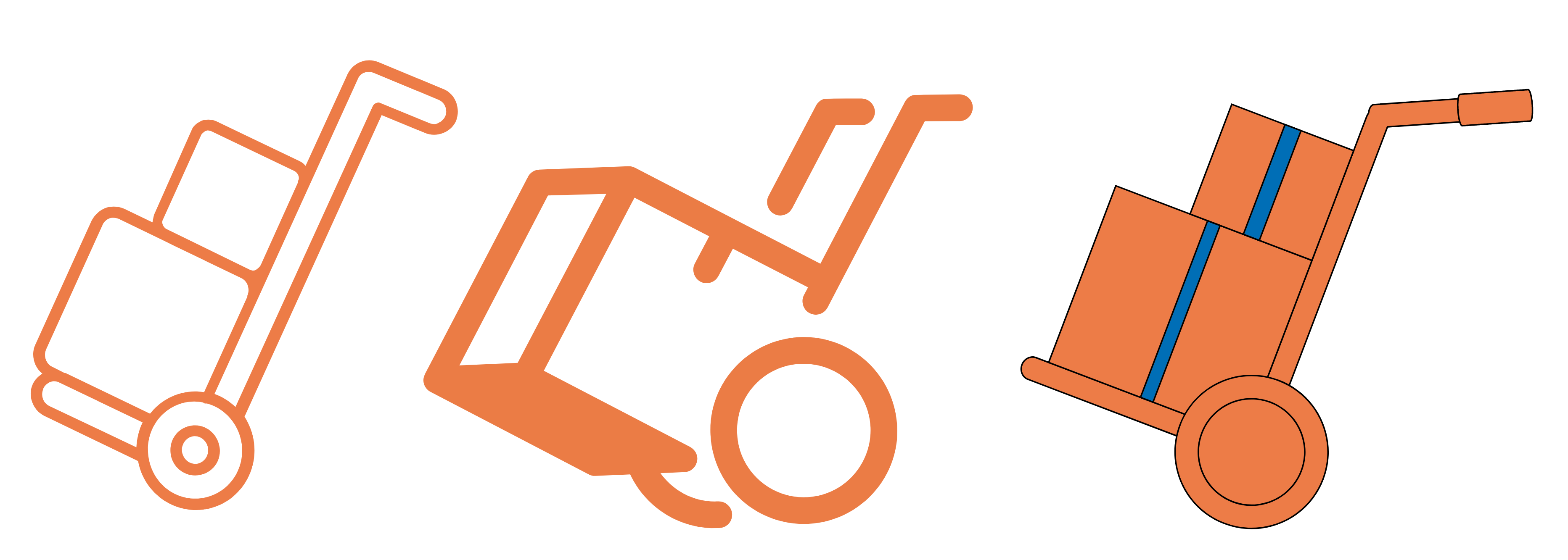
The Trolley Parcel
We went back and forth on the type of parcel that we wanted to use. First, we tried out with parcels on a trolley. At a glance, it would be easy to recognise that we are a courier service. It also looked similar to our original logo which had a handle and wheels.
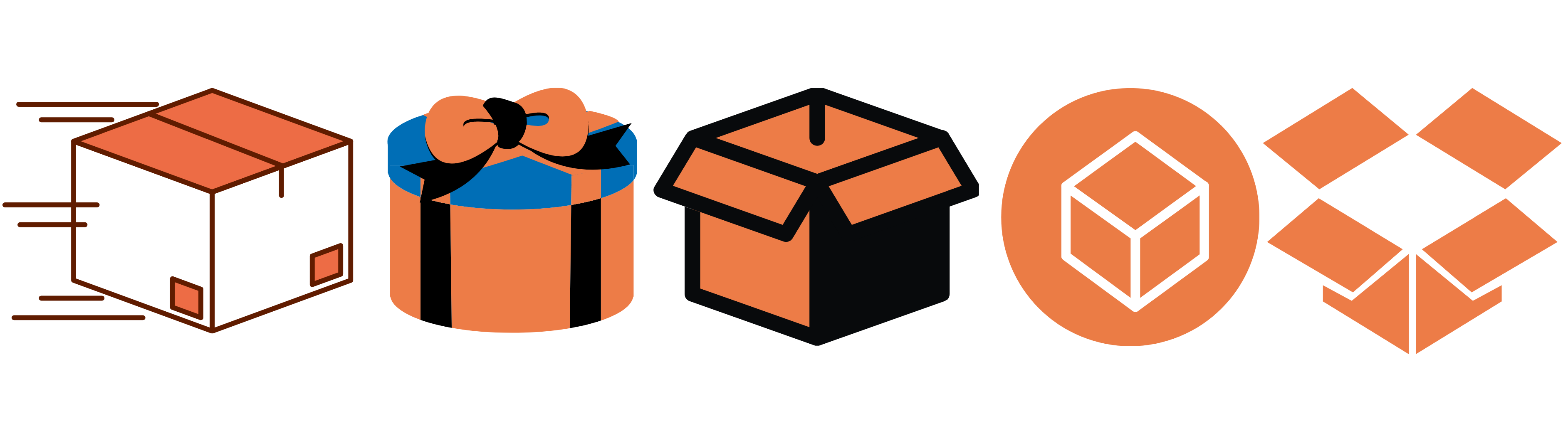
One Parcel Only
However, we wanted a logo that had elements of gifting and luxury because we were more than just a logistical courier service. We decided to do away with the trolley. Instead, we tried out with just a simple parcel.

Stacked Parcels
While the parcel icon did make the logo more modern, we felt that it did not have the height that it required to fit the font of our logo. Hence, we decided to stack the parcels. We tested out the number of parcels stacked and ultimately, however, it still felt that the logo lacked the elegance we wanted.
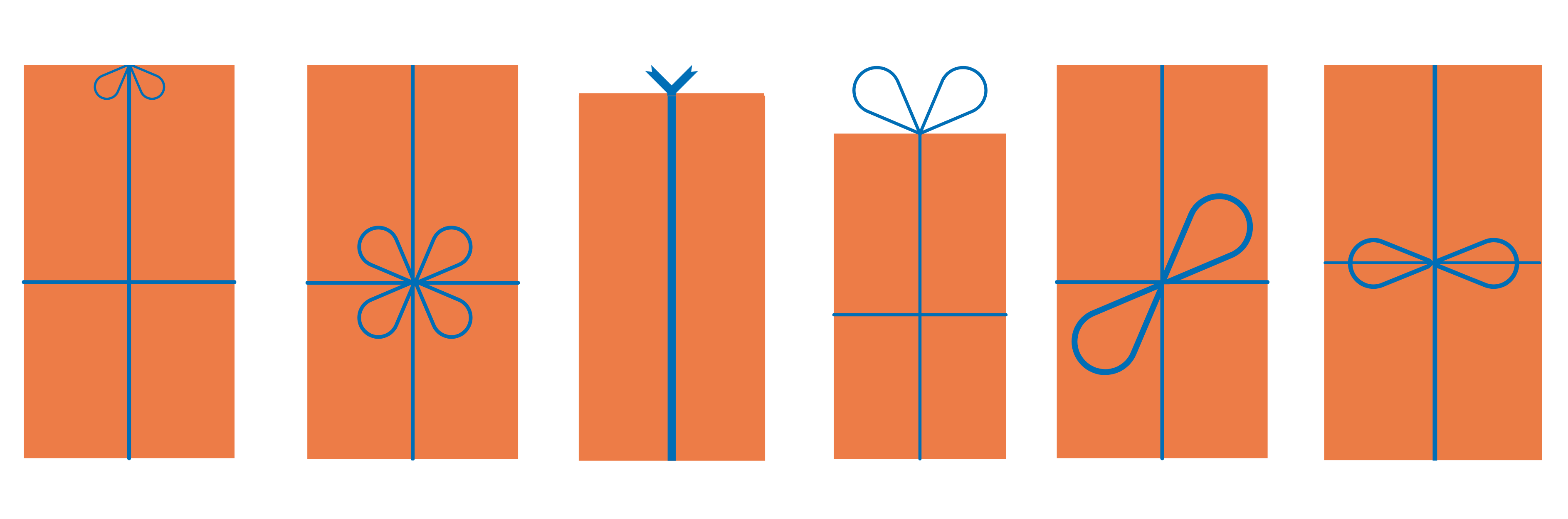
Finding Balance in Height
We knew we wanted a parcel with height to but at the same time somthing that was simple. Hence, we decided to go back to one parcel and tried playing around with the orientation and height.
The Final Design
After much thought and consideration, Travelhorse is proud to unveil our new logo. We hope that its simple, refined and elegant design resonates well with our mission of being a reliable, efficient, smart and genuine last mile logistics platform.

We love giving you behind-the-scenes peeks at the work we do at Travelhorse. What would you like to see? Let us know on social and we’ll consider your ideas for our next post.